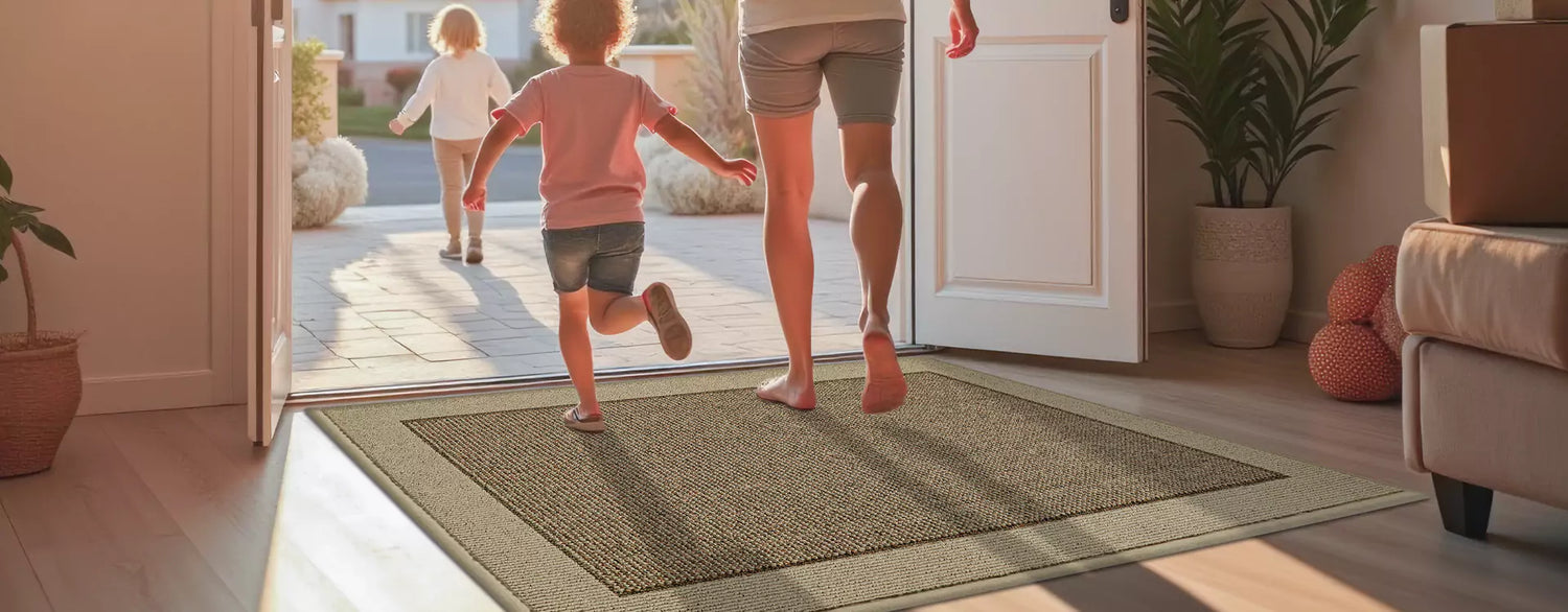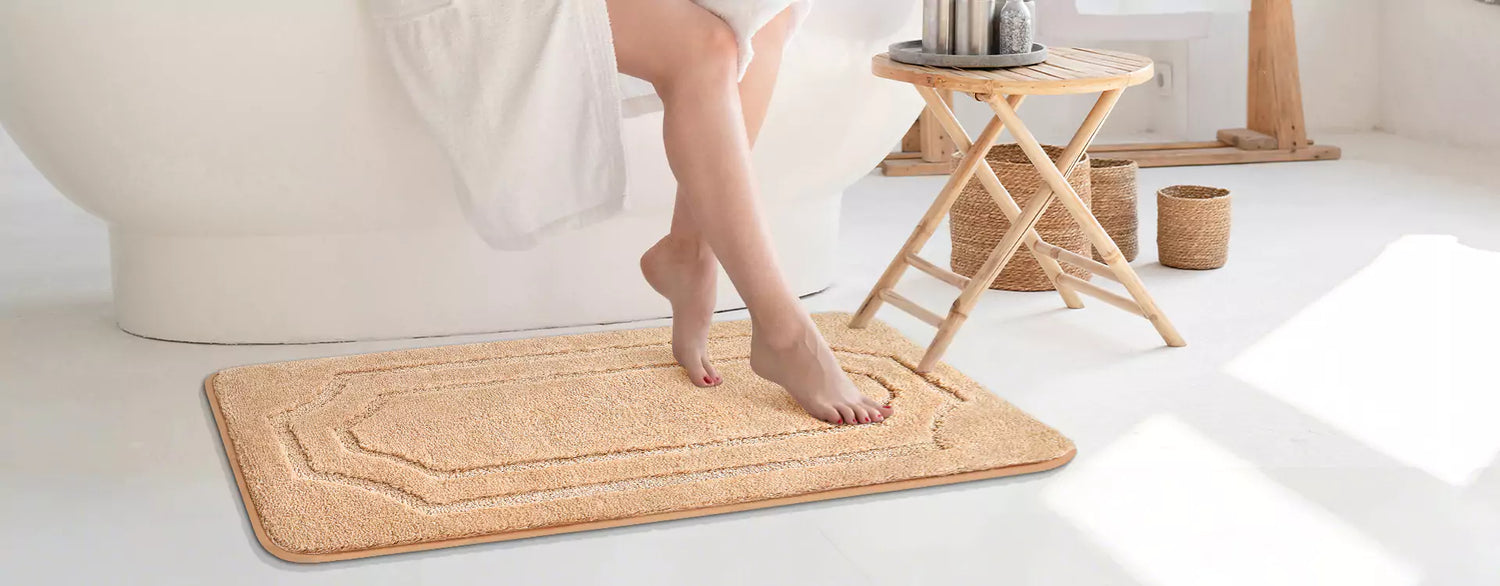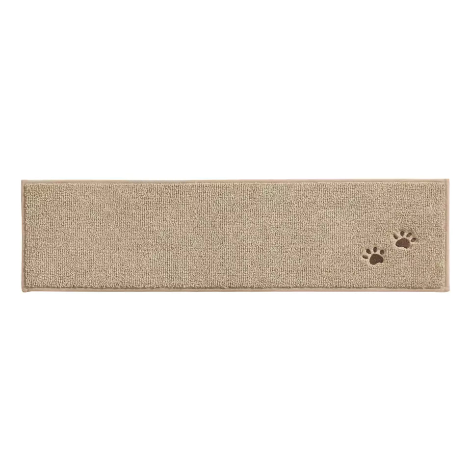


For fall, the best mat colors are mid-tone earth colors — camel, warm brown, terracotta, ochre, and muted green — because they do two jobs at once. They echo the season's palette that design forecasters confirmed for 2026, and, less glamorously, they match the color of the dirt your shoes actually carry in during the wettest, leafiest season of the year. A mid-tone warm mat hides soil better than any very light or very dark mat, and the best match depends on your dirt: reddish clay rewards reddish browns, pale dust rewards darker browns, and wet oak leaves punish the palest mats of all.
Table of Contents:
- Why a Fall Mat Color Is a Working Decision, Not Decor
- Top Fall Mat Colors: The 2026 Palette at a Glance
- Ochre and Mustard Mat Colors: The Golden-Hour Glow
- Warm Brown and Camel Mat Colors: The Grounded Base
- Terracotta and Rust Mat Colors: The Sunset Warmth
- Muted Green and Slate Blue Mat Colors: The Quiet Contrast
- The Soil-Match Method: Choose a Mat Color That Hides Your Dirt
- Fall Mat Pairings for Your Floor
- Our Warm Mat Colors: What We Make and What We Don't
- Caring for Fall Mats: Wet Leaves, Tannin Stains and Fading
- Fall Mat Color Questions, Answered
- Sources and verification
Why a Fall Mat Color Is a Working Decision, Not Decor
A mat is the hardest-working textile in your home, and fall is its hardest season. Leaves, rain, mud and early darkness all arrive together, so the color you choose in September will be judged under worse conditions than the color you chose in June. That is why we treat "fall mat color" as a working decision with three inputs — the season's palette, your floor, and your dirt — rather than a mood board.
There is also a timing argument, and it is data-based. The 2026 Colors of the Year, announced by the major paint brands between September and December 2025, landed almost unanimously on earth tones: Sherwin-Williams chose Universal Khaki (SW 6150, a warm tan, LRV 40.6), Benjamin Moore chose Silhouette (AF-655, a burnt umber with charcoal notes, LRV around 9–10), Behr and Valspar chose smoky greens, and Glidden chose a deep red-brown, Warm Mahogany. A mat bought in an earth tone this fall is therefore not a six-week impulse — it matches the color direction the paint industry has committed to for the whole coming year. Buy the mat now; if anything, the walls will catch up to it.
Top Fall Mat Colors: The 2026 Palette at a Glance
For authority on the season's exact shades, we use the Pantone Color Institute's Fashion Color Trend Report Autumn/Winter 2026/2027 for New York Fashion Week, released in February 2026. Its top-ten list is unusually earth-heavy, and Executive Director Leatrice Eiseman framed the season as "a reverence for authenticity." The table below maps the fall mat color families against the closest named 2026 anchors.
| Mat color family | Closest 2026 trend anchor | Pairs naturally with | Hides well | Shows badly |
|---|---|---|---|---|
| Ochre / mustard | Pantone Acacia 13-0640 (green-infused yellow) | Walnut, cream, black metal | Pale dust, sand | Dark mud, wet leaves |
| Camel / caramel | Pantone Toffee 18-1031, Candied Ginger 15-1213 | Almost everything — the neutral of the year | Both light and dark soil (mid-tone) | Nothing major |
| Walnut / mahogany brown | Pantone Arabian Spice 19-1245, Red Mahogany 19-1521 | Oak floors, brass, rust accents | Mud, dark stains | Pale lint, light pet hair |
| Terracotta / rust | Pantone Muted Clay 16-1330 | Cream walls, wood, olive green | Red clay, rust-toned dust | Pale dust, lint |
| Muted green | Pantone Burnt Olive 18-0521, Neptune Green 14-6017 | Oak, cream, terracotta | Grass, leaf fragments | Pale dust |
| Slate blue / charcoal | Pantone Poseidon 19-4033, Underworld 17-4005 | Grey floors, white trim | Urban grit, dark stains | Pale lint, light pet hair |
Two patterns in that table drive everything else in this guide. First, the mid-tones (camel, taupe, mid-brown) are the all-round soil hiders. Second, the extremes — very pale ochre, very dark charcoal — trade a styling gain for a maintenance cost, and whether that trade is worth it depends on your entryway, not on the trend report.
Ochre and Mustard Mat Colors: The Golden-Hour Glow
Ochre and mustard are the shades that make an entryway feel like late afternoon in October. Pantone's nearest anchor, Acacia, is described as a "potent, green-infused yellow" — more spark than spread. That points to the real rule with this family: the mat is the smallest textile in the room, which is exactly why it can carry the most saturated color. A mustard mat that would shout as a sofa reads as a confident accent at 20 by 32 inches, against walnut doors, cream walls and black hardware.
One honest note from our side: BEQHAUSE does not currently manufacture an ochre or mustard mat, and we would rather say that than stretch the word "beige" to cover it. If you want this shade, printed or custom doormat retailers are the realistic source this year.
Tip — the 5:30 pm swatch test. Autumn sun sits low, and low-angle daylight is dramatically warmer than noon light (photographers count golden hour around 2,500–3,500 K versus roughly 5,500 K at midday). Judge a yellow-gold mat under the light that is actually in your entry when you come home. A mustard that glows at 5:30 pm can look flat and green-ish under a north-facing window's noon sky — and the reverse is true for cool greys.

Warm Brown and Camel Mat Colors: The Grounded Base
If you only take one color family from this article, take this one. Camel, caramel and walnut brown sit at the centre of the 2026 palette — Pantone's seasonless Toffee is literally described as "a tasty brown displaying a timeless yet contemporary elegance," and its standout list adds Arabian Spice ("a piquant brown whose raw, earthy warmth") and Red Mahogany ("a quietly indulgent red-toned brown"). The paint industry agrees: two of the five big 2026 Colors of the Year are warm browns.
The practical reason to anchor your entry here is unglamorous and decisive: brown family mats are the best all-round soil hiders in flooring retail guidance. Australian flooring retailer Choices Flooring puts it plainly in its carpet colour guide — mid-tone colours that are "naturally similar to dust or sand" hide everyday soil, and earthy tones like brown, tan and grey are "champion at concealing dirt" because they match the colour of the soil itself. Mid-browns hide gradual discoloration; darker browns mask deep stains. Our own warm range — Beige/Taupe, Light Brown, Brown and Dark Brown — exists almost entirely inside this family, and our Beige/Taupe is the closest thing we sell to the camel and toffee tones of the moment.
Terracotta and Rust Mat Colors: The Sunset Warmth
Terracotta is the headline color of Pantone's autumn list. Muted Clay 16-1330 is described as "a casually rustic, grounded and enduring terracotta tone imbued with inherent warmth" — and "enduring" is the word that matters, because rust is that rare trend shade that also behaves like a neutral. It bridges cream and wood, it flatters olive and slate green, and it carries a sunset-inspired warmth that cool-toned LED lighting cannot flatten.
Terracotta also has a hidden functional edge, which we will build on in the soil-match section below: in regions with red clay soil, a clay-red mat is the single best dirt-hiding choice you can make. Style and soil alignment rarely cooperate this neatly.
Honesty first, though: our closest catalog color is a true Red, and a true red is brighter and cooler than the dusty, burnt terracotta of the trend. If you order our Red expecting rust, check the product photography carefully first. For a faithful Muted Clay look this year, look to paint and accessories — or to retailers who dye specifically for terracotta.
Muted Green and Slate Blue Mat Colors: The Quiet Contrast
Not every fall entry wants warmth on the floor. Muted green is the other big story of the 2026 season — Pantone lists Burnt Olive ("a richly layered green tone") and Neptune Green among its ten standouts, and both Behr (Hidden Gem, a smoky jade) and Valspar (Warm Eucalyptus) made green their 2026 Color of the Year. A mossy or sage mat works like the last leaves on the branch: it reads seasonal without competing with pumpkin-and-plaid decor, and it hides grass and leaf fragments better than any warm shade.
Slate blue and charcoal play the same quiet role on the cool side. Pantone's seasonless Underworld is a mid-grey built to be a foundation, and Poseidon a confident ocean blue. Our Navy Blue, Dark Grey and Charcoal mats belong here. Two cautions from the soil science below: very dark mats spotlight pale lint and light pet hair, and blue is the hardest color in which to hide urban grit. Choose slate tones in the mid-range, not midnight.
The Soil-Match Method: Choose a Mat Color That Hides Your Dirt
Here is the angle most color articles leave out: the most flattering fall mat is the one that matches your region's debris, not just your decor. You track in a specific palette of dirt every day this season — and when the mat's color is close to that palette's, soil becomes invisible between washes; when it contrasts, the mat looks dirty two hours after you clean it. Choices Flooring's pro insight makes exactly this argument for wall-to-wall carpet: red-clay country rewards reddish-brown tones, beach towns reward sandy beige. A mat obeys the same logic in miniature.
| Your dominant fall debris | Where it's common | Best mat tones | Tones that fail |
|---|---|---|---|
| Red-orange clay soil | Southeast US, red-rock regions | Terracotta, mahogany brown, rust | Beige, ochre (clay reads as stain) |
| Pale dust, sand, dry grit | Coastal, dry climates, gravel drives | Dark brown, charcoal, camel | Very light beige (shadow halos), black (lint) |
| Wet oak leaves (tannin) | Mature-oak neighborhoods | Mid-brown, taupe, olive | Cream, ochre (brown tannin prints show) |
| Urban street grit, asphalt dust | Cities, near roads | Mid-grey, slate, camel | Navy, bright red (grit reads as shadow) |
| Light pet hair, pale lint | Any shedding household | Mid-brown, camel, heathered mixes | Charcoal, black, navy |
How to run the method in one minute: spread a white paper towel on your current mat's spot, sweep your doormat brush over it, and look at what collected. That smudge is your dirt palette. Buy the mat color closest to it.
Fall Mat Pairings for Your Floor
Color does not exist in isolation — the mat sits on a floor that has its own undertone. The rule we use: match depth, contrast undertone. A mat close to your floor's lightness blends in (calm but forgettable); one to two steps darker or lighter reads deliberate. Undertones, however, should complement rather than repeat: warm floor, cooler-leaning mat, and vice versa.
| Your floor | Warm-toned mat pick | Cool-toned mat pick | Avoid |
|---|---|---|---|
| Honey / oak hardwood | Terracotta, camel | Muted olive green | Red-toned mahogany (blurs into the wood) |
| Dark walnut | Camel, ochre accent | Slate blue, mid-grey | Very dark brown (black-hole effect) |
| Grey laminate / wood-look | Warm taupe, camel | Charcoal, slate | Golden ochre (clashes with grey undertone) |
| Stone / slate tile | Warm beige-taupe | Charcoal, navy | Mid-grey (disappears entirely) |
| Cream carpet or tile | Walnut brown (definition) | Muted green | Camel on cream — no contrast edge |

Our Warm Mat Colors: What We Make and What We Don't
BEQHAUSE's range covers the camel-to-walnut span of the fall palette well, has a muted green and a navy/slate end, and does not include ochre, mustard or true terracotta. All of our door and kitchen mats use polyester pile with a non-slip TPR backing rated for dry indoor floors, and all are machine washable in cold water — manufacturer specs from our own product pages.
| Our mat (all machine washable) | Closest fall color | Sizes | Price |
|---|---|---|---|
| Solid Color Dirt Trapper Plain Doormats | Camel (Beige/Taupe), walnut (Brown), slate (Charcoal) | 17"×30" up to 24"×60" | $23.99 |
| Embossed Diamond Lattice with Border Door Mats | Warm Beige, Light Brown, walnut Brown | 20"×32" up to 3'×5' | $23.99 |
| Solid Colored Striped Border Dirt Trapper Door Mat | Beige/Taupe, Brown, Charcoal | 20"×32" up to 24"×60" | $24.99 |
| Dirt Trapper Plain Double Door Entry Mat | Beige/Taupe, Brown, Green | 24"×72" up to 32"×120" | $49.99 |
| Solid Color Plain Comfortable Kitchen Mats | Beige/Taupe, Brown, Green | 20"×32" up to 24"×72" | $23.99 |
| D Shaped Small Area Rugs for Kitchen | Taupe, Brown, Green, Red | 18"×30" up to 24"×60" (sets) | $18.99 |
| Double Framed Tufted Bath Mats | Beige/Taupe, Green, Grey | 16"×24" up to 24"×48" | $17.99 |
Who we are right for this fall: anyone styling in camel, taupe, walnut, olive or slate — which, per the 2026 forecasts, is most of the season's palette. Who we are not right for: anyone set on ochre, mustard or dusty terracotta.
Caring for Fall Mats: Wet Leaves, Tannin Stains and Fading
Fall's signature cleaning problem has a chemistry name: tannin. Oak leaves are particularly rich in tannins — water-soluble polyphenol compounds — and when wet leaves sit on a mat, the tannins leach out and leave brown, leaf-shaped prints, the same chemistry that stains patios and paving under oak trees. On a pale mat, one rain-soaked oak leaf can print its whole silhouette. The defenses are operational, not chemical heroics: pick wet leaves off the mat promptly, and never let a sodden leaf pile sit overnight.
| Problem | What is happening | Quick fix |
|---|---|---|
| Brown leaf-shaped prints | Tannins leaching from wet leaves (oak worst) | Shake/vacuum leaves off daily; wash mat; for stubborn prints use an oxygen-bleach soak, not chlorine bleach |
| Mud dried grey-white | Clay and grit particles sitting in the pile | Let dry fully, vacuum, then wash — wet-scrubbing mud only drives it deeper |
| Dull, faded surface after months | Pile crush and soil film, not usually dye loss | Cold machine wash; our mats are washable without fading per our product pages (manufacturer statement) |
| Permanent dark patch under mat | Moisture trapped against some floor finishes | Lift and dry the mat weekly; TPR backings are for dry indoor floors — check your floor finish's care sheet |
Care tip: because tannin staining is moisture-driven, the pale ochre and cream mats that look so good in dry September are the riskiest choice under a big oak in rainy October. If your entry collects leaves and rain, a mid-brown or taupe mat is the fall color you will still be happy with at Thanksgiving.

Fall Mat Color Questions, Answered
Which mat color hides the most dirt?
Mid-tone camel, taupe and warm brown. Flooring guidance converges on the same finding: mid-tones with low contrast hide both dark soil and pale debris, while the extremes fail — very light mats spotlight dark mud, very dark mats spotlight lint, dust and light pet hair. Patterned and heathered surfaces hide more than solids for the same reason.
Do dark mats show more dirt than light mats?
Different dirt. A charcoal mat will hide dark mud and stains well and then look untidy from pale dust, crumbs and pet hair within days. A cream mat does the opposite. Neither is "low maintenance" — they just fail in opposite directions, which is why the mid-tone families win for entryways.
What mat color works with gray floors?
Warm taupe or camel. Grey floors carry a cool undertone, and the fix is contrast: a warm mid-tone keeps the pairing from reading cold. Pure grey-on-grey disappears, and golden ochre fights the undertone.
Are fall earth-tone mats a trend that will date?
Less than you would expect. The 2026 Colors of the Year across Sherwin-Williams, Benjamin Moore, Behr, Valspar and Glidden are all earth tones — warm browns, tans and greens — and Pantone's AW 2026/27 palette is built on clay, spice brown, mahogany and toffee. Earth tones have also been the flooring-industry baseline for soil-hiding for decades. A camel or walnut mat is trend-aligned and maintenance-proof; that combination is as close to timeless as a seasonal purchase gets.
Can a fall mat work in the kitchen and bathroom too?
Yes — and it is the cheapest way to make the palette feel intentional. Repeating one warm tone (a taupe doormat, a camel kitchen mat, a taupe bath mat) ties three rooms together for under $70 in our range. Cool-tone households can do the same with sage or slate.
Sources and verification
- Pantone Color Institute, Fashion Color Trend Report Autumn/Winter 2026/2027, New York Fashion Week (published February 2026; retrieved 2026-09-28): Muted Clay 16-1330, Arabian Spice 19-1245, Red Mahogany 19-1521, Acacia 13-0640, Burnt Olive 18-0521, Neptune Green 14-6017, Poseidon 19-4033, Underworld 17-4005, Toffee 18-1031, Candied Ginger 15-1213, and the Leatrice Eiseman quote. pantone.com
- Sherwin-Williams 2026 Color of the Year, Universal Khaki SW 6150, #B8A992, LRV 40.6 (retrieved 2026-09-28, via PaintColor HQ's 2026 COTY roundup).
- Benjamin Moore 2026 Color of the Year, Silhouette AF-655, burnt umber with charcoal notes, LRV ≈ 9–10 (retrieved 2026-09-28, via PaintColor HQ).
- Behr Hidden Gem (smoky jade), Valspar Warm Eucalyptus, Glidden Warm Mahogany — 2026 Colors of the Year (retrieved 2026-09-28, via PaintColor HQ roundup).
- Choices Flooring (AU), "Carpet Colour Guide: How to Choose the Perfect Shade" (retrieved 2026-09-28): mid-tone and earth-tone soil camouflage; red-clay and beach-sand color-matching pro insight.
- Flooring Clarity, "Best Carpet Colors That Hide Dirt" (retrieved 2026-09-28): "medium-toned, low-contrast colors tend to provide the best camouflage"; dark carpets highlight lighter dust and pet hair.
- LTP Online, "The Trouble with Tannins" (retrieved 2026-09-28): tannins as water-soluble polyphenols; leaf-shaped staining; oak particularly rich in tannin.
- Hunker, "How To Remove Oak Tree Stains From Pavers," reviewed by Victoria Lee Blackstone (retrieved 2026-09-28): oak leaves and acorns as tannin sources; oxygen bleach as the safer cleaner; chlorine bleach cautions.
- BEQHAUSE product data: beqhause.com product catalog, products.json (retrieved 2026-09-28) — colors, sizes and prices in the "Our Warm Mat Colors" table, plus polyester/TPR and washability specifications from our own product pages (manufacturer statements, not independent tests).